Dashboard UI/UX: How to Guide User Attention
Global Relocate is a consulting firm helping Africans to identify jurisdictions with better opportunity for life and work.
While “geo arbitrage”, “remote work” and “flag theory” have become a big trend among young professionals in the west, Africans often lack the information and resources to relocate.
In many African countries, the digital economy is bustling and young entrepreneurs can grow a business online and relocate.
Global Relocate provides an overview of the available options. Users can enter details about their preferences and apply filters to find places that meet their needs.
Understanding User Needs First
Before designing any dashboard, you need to understand your users’ primary goals and frequent tasks.
Follow your users in their work environment to observe their actual needs rather than stated preferences.
Identify key decisions they need to make and ensure your dashboard supports these.
Creating an Effective Information Hierarchy
Organize information based on importance and frequency of use. Place mission-critical elements at the top where they’re instantly visible.
Group related metrics together to facilitate comparison and context.
Use progressive disclosure to manage complexity—show high-level metrics by default with clear paths to drill down for details when needed.
Choosing the Right Visualizations
Match visualization types to your data’s purpose: line charts reveal trends over time, bar charts excel for comparisons, scatter plots show relationships between variables, and heatmaps highlight patterns in complex datasets.
Avoid visualization types that obscure data relationships (like pie charts with too many segments). Keep visualizations simple—each should answer a specific question rather than trying to communicate everything at once.
Designing for Scannability
Users should be able to understand dashboard status within seconds. Use consistent visual patterns for similar data types across the dashboard. Create clear visual hierarchies with typography, size, and color to guide the eye to what matters most. Implement information layering—provide overview information for quick scanning with the ability to access details on demand.
Using Color Strategically
Limit your color palette to enhance comprehension rather than decoration. Reserve bright colors for important alerts, deviations, or actionable items.
Ensure sufficient contrast between text and backgrounds for readability. Use color consistently throughout the dashboard so it carries the same meaning everywhere (e.g., red always indicates problems, green always indicates success).
Optimizing for Different Devices and Contexts
Design responsive dashboards that work across device sizes, from large monitors to tablets. Consider how the dashboard will function in different lighting conditions and environments.
Prioritize which elements should remain visible when space is constrained. Test your designs in actual usage environments—a dashboard that looks perfect in your design tool might be unusable in bright office lighting.
Incorporating Effective Filtering and Controls
Place filters prominently and make their current state always visible. Allow users to save filter combinations for frequently referenced views. Design clear visual feedback when filters are applied so users understand they’re looking at a subset of data. Position control elements consistently so users don’t need to hunt for functionality.
Handling Data Freshness and Loading States
Clearly indicate when data was last updated and whether it’s real-time or historical. Design thoughtful loading states that preserve context rather than showing empty containers. Implement partial updates when possible so the entire dashboard doesn’t refresh simultaneously. Consider using skeleton screens instead of spinners to reduce perceived loading time.
Supporting Decision-Making Beyond Data Display
Include contextual information that helps interpret metrics, such as targets, thresholds, or historical comparisons. Design affordances for common follow-up actions directly within visualizations.
Provide annotation capabilities so users can document insights for themselves or colleagues. Remember that seeing data is only part of the process—users often need to act on insights immediately.
Measuring Dashboard Effectiveness
Implement analytics to track which dashboard elements are used most frequently. Conduct regular user interviews to understand evolving needs and pain points. Measure time-to-insight for critical tasks to ensure your design supports efficient decision-making. Be prepared to iterate based on actual usage patterns rather than initial assumptions.
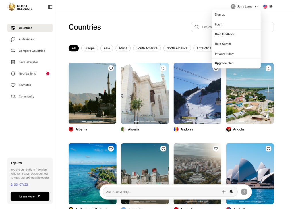
| Principle | Example from Image | Effect on User Attention |
|---|---|---|
| Clear Hierarchy | Bold “Countries” header | Instantly orients user |
| Consistent Navigation | Sidebar with icons and labels | Reduces confusion |
| Visual Grouping | Country cards with images/flags | Eases scanning and comparison |
| Highlighted Actions | Notification badge, active filters | Draws eye to key areas |
| Actionable Elements | Heart icon, dropdown menu | Encourages interaction |
| Feedback & Status | “Try Pro” timer and status box | Keeps user informed |
| Minimal Distractions | Ample whitespace, no clutter | Reduces cognitive overload |
| Personalization | User avatar, language selector | Enhances engagement |